Check Out the Latest Mobile Experience Upgrades on Samtec.com
In 2020, mobile traffic has skyrocketed everywhere as our planet battles a pandemic. Samtec.com saw nearly double the mobile traffic in the first two quarters than it normally sees.
While these levels have dropped off from their peaks in the spring, they have not returned to their pre-pandemic levels completely. It appears many mobile users have discovered the increasingly pleasant mobile experience on Samtec.com, and have been using it quite often.
Here are a couple of recent updates we’ve made to the Samtec.com mobile experience.
Easier-to-Read Mobile Font
We’ve updated the font in our login area, as well as the rest of Samtec.com to be slightly stronger. With screen resolutions increasing, mobile fonts can sometimes appear smaller and lighter, so we’ve added this extra weight to the font on Samtec.com to reduce eye strain and make the reading experience more user-friendly.
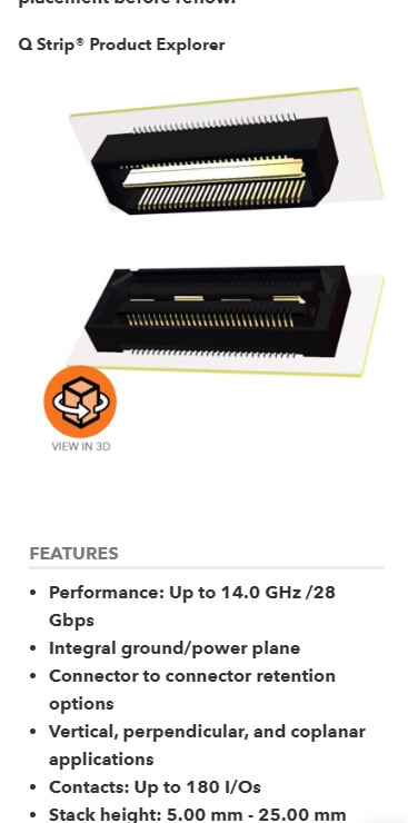
This was a fairly significant update, since it touched essentially all of our font implementations, including paragraphs, heading, list elements, and more.
You can take a look at any page on Samtec.com, but here is a good one to show off the variety of places this is used.
https://www.samtec.com/connectors/high-speed-board-to-board/mezzanine/qstrip
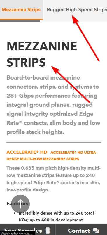
New Mobile Category Navigation and Headings
We’ve also rebuilt our subcategory navigation from the dropdown we were previously using, to a swipe-friendly user interface.
Users can now swipe right or left to navigate pages in our category and subcategory using this beautiful new menu.
We’ve also included a new heading on the subcategory pages so users can more easily tell where they are on mobile devices.
Lastly, there are simple breadcrumbs included on each mobile navigation page as well to provide easy access to the previous page.
All of these updates combined makes browsing Samtec.com on mobile devices quite pleasant.
You can check out these new updates here on the Mezzanine page – https://www.samtec.com/connectors/high-speed-board-to-board/mezzanine
Coming Soon
Just as a website is never done, the mobile experience of a website is never done. Next up, we’ll be working on bringing you an updated user profile experience on mobile (and desktop) devices, as well as working towards optimizing the checkout experience for mobile users as well.
Stay tuned for updates in those areas.
Send Us Your Feedback
Thanks for following along and being a loyal reader of The Samtec Blog.
We’re always looking for ways to improve your online experience.
Drop your email address in the form below if you want to stay in the loop with these updates, as well as the rest of our blog content.
If you have any feedback or suggestions for our web team, feel free to send an email to [email protected].