Your “Tech Specs” Pages Just Got a Major Upgrade
The web team at Samtec has just completed its most recent major release, which is one we’ve been waiting to bring you for quite some time.
This comes to you in the form of a new “Technical Specifications” page, which is the heart and soul of product research on Samtec.com.
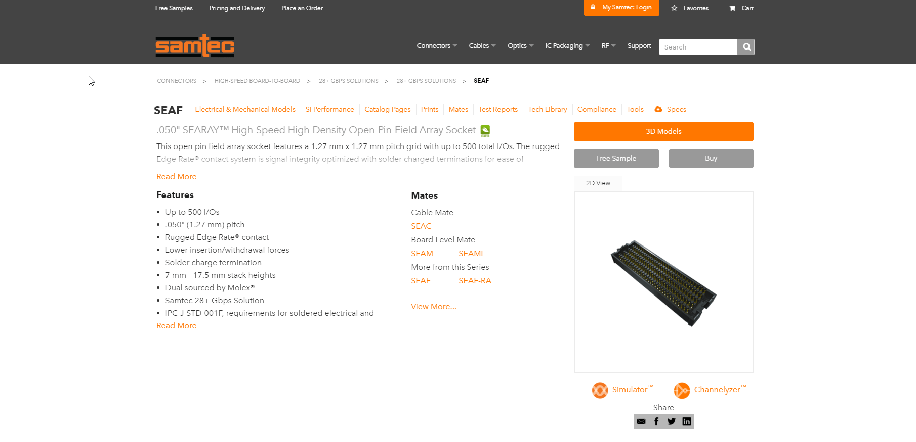
On this page, you can perform research on a series level (QSE, TSW, SEAF, etc) by accessing various types of product documentation without the need for a login (yes, even real-time 3D models).
Across hundreds of possible Samtec products, these pages gather over 155,000 views every month, which is a very significant portion of total Samtec.com traffic.
Upgraded Design and User Experience
At first you’ll notice the layout is much cleaner and more modern than the previous version. Over the last couple of years, our users expressed the need for a more utilitarian design that just delivered product documentation without all of the “bells and whistles.”
We listened, and did our best to keep the experience as friendly as possible along the way.
Here is the new design, which is now live on Samtec.com.
On top of the design, there are also several other new features that this release brings to you, which we’ll detail in this blog post.
Globally Distributed Cloud-based Web Hosting
One of the largest upgrades to this suite of pages isn’t anything that you’ll see with your eyes, but has a significant impact on your experience.
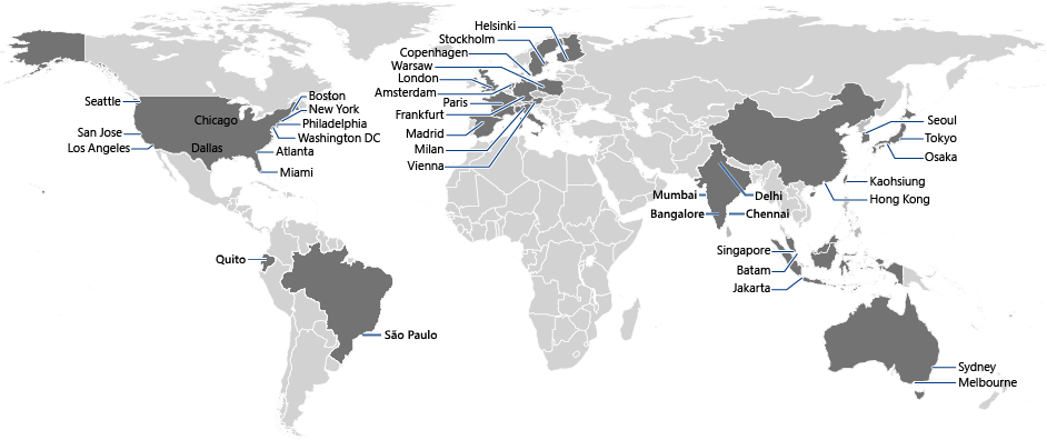
We’ve moved how you access these pages from a single US-based hosting location, to four strategically located points across the globe – hosted in the Microsoft Azure cloud.
The biggest improvement that this back-end architecture upgrade provides is a significant reduction in latency and page load times for all users across the world.
For example:
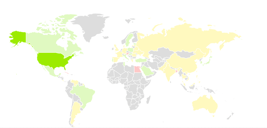
Previously, a user in Europe would receive Samtec.com from the same location as a user in the United States. The US based user might have a solid experience in this case, but the back-and-forth time for the European user almost always resulted in a fairly slow experience.
The same thing happened for any user not located in the US, resulting in a sub-par experience for most international users (green = good, yellow = ok, red = bad).
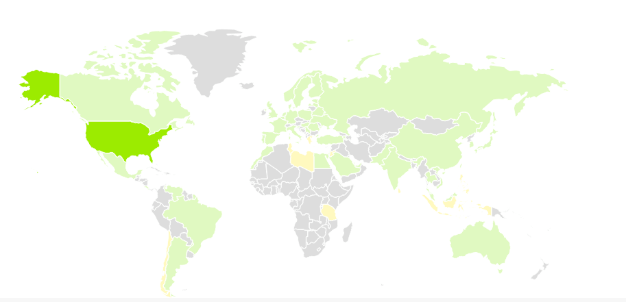
But now, using Microsoft Azure’s Global Traffic Manager, users interact with the server that will deliver the highest level of performance to them at that specific point in time (not necessarily always the closest one – this is based on a number of different factors).
With this update, our global pageload times on this area of the website have gone from 12 seconds on average, to 2.3 seconds for all users across the world – an improvement of over 421%, resulting in a much “greener” speed map!
This also adds a large amount of redundancy (a good thing in the hosting world) to Samtec.com, virtually eliminating the chance that widespread downtime will occur.
“Important Stuff First” Architecture Delivers Your Experience Faster
With this 421% pageload time improvement, there is quite a bit of nerd wizardry happening behind the scenes.
On top of the Azure architecture, we’ve also created our own deferred loading engine, taking a page out of Google’s Web Speed Best Practices playbook. This allows us to deliver the basics of the page to you very quickly, and then load the remainder of the documentation you may need behind the scenes.
This eliminates the front-loaded waiting that normally occurs with a very heavy webpage such as this, and allows you to access basic information much more quickly than what was previously possible.
You’ll notice this as you see the menu at the top load in order of the documentation blocks, as well as the loading animation towards the bottom of the page.
Once all of the menu elements are populated at the top, you know exactly when the rest of the page is available.
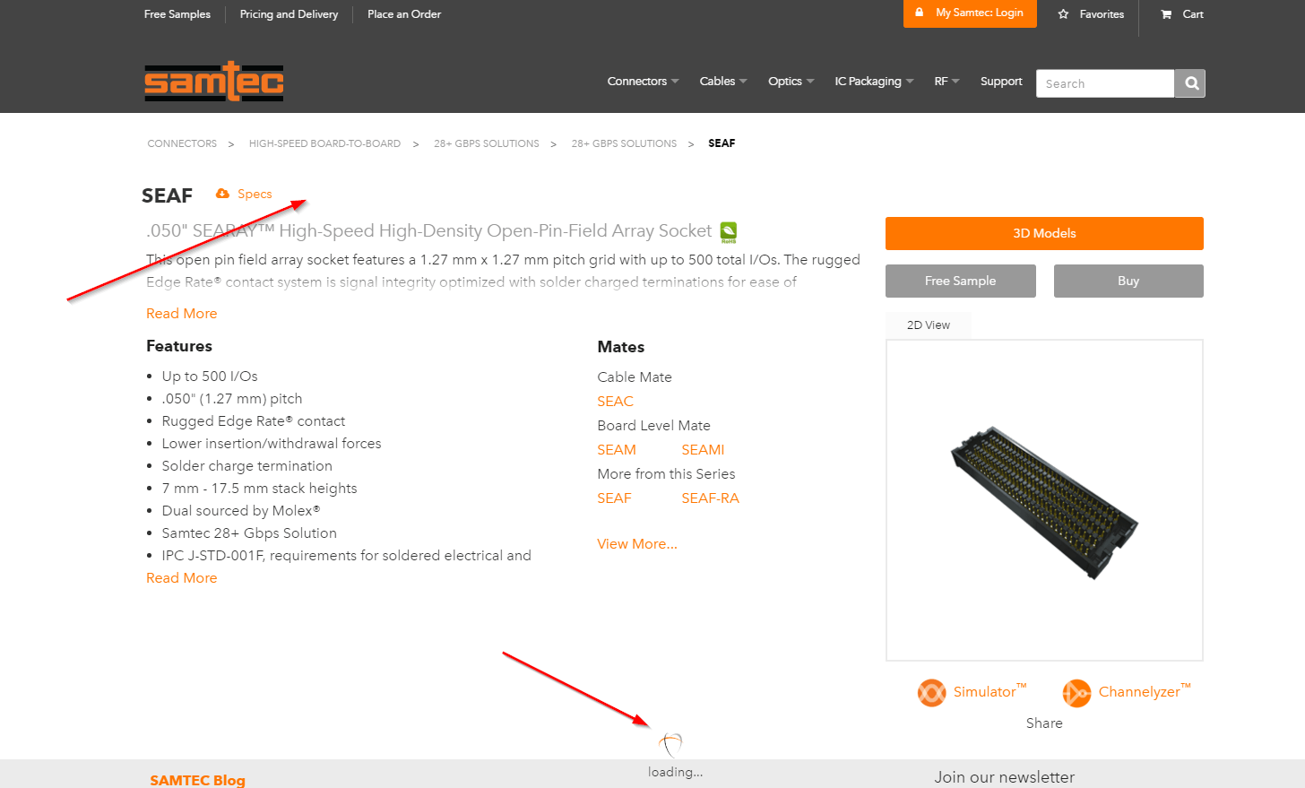
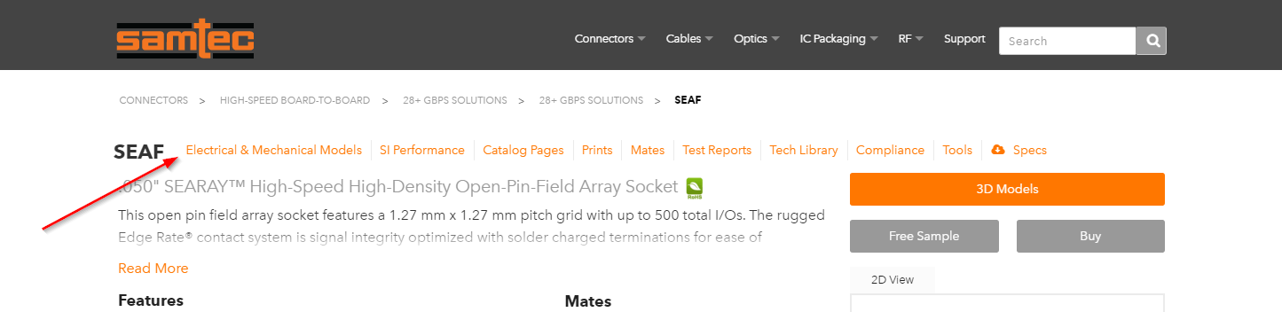
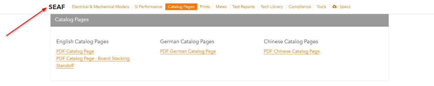
Omnipresent “Sticky” Menu
One of the most requested features we have received over the past couple of years was for an easier way to access all types of product documentation from anywhere on the Tech Specs page.
The easiest thing to do would be to just lump it all together in one spot, but since we have so many different types of documentation readily available, this was too overwhelming for the user. It was also a poor use of vertical space attempting to create a stacked menu like on some of the pages earlier in the navigation. There is just too much to display for that to work.
To solve this problem, our design team came up with what we’ve come to know as our “sticky menu,” which you’ll also see in various places throughout the rest of Samtec.com.
On the initial page-load, the sticky menu is in a routine place for any type of sub-navigation. Normally, the problem with a menu in this position is the user will lose sight of it once they scroll a few hundred pixels.
This is where the “sticky” functionality comes in.
Once you scroll past a certain point on the page, the menu begins to follow and gets anchored at the top, making it easily accessible wherever you choose to go.
The effect becomes that a single click on any document type gets you to any point on the page you wish to go, without the need for scrolling.
It may seem like a simple innovation, but this has been one of the most widely applauded user experience-oriented features of this release.
Real-Time 3D Models Across All Devices and All Major Browsers
The number of 3D models requested from Samtec.com has skyrocketed over the last few years. Because of this, one of the major goals of this release was to make the process to get a 3D model much more user-friendly and, of course, faster!
Web Technology has evolved pretty heavily in the past few years, and we wanted to take full advantage of this to bring you 3D models as quickly as possible.
You can now download a 3D model for the vast majority of Samtec series in under a minute. Nearly 100 different types of software are supported.
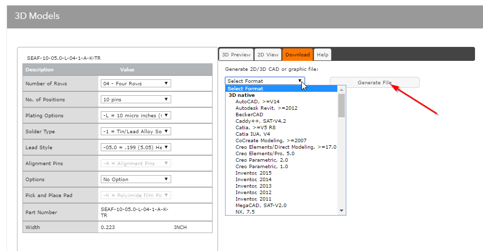
At the top right of each series page, you’ll notice a giant orange 3D models button.

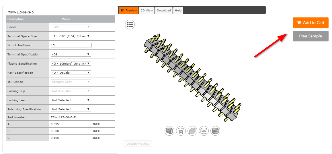
One simple click on this will take you to our Part Configurator, which allows you to configure and view any part combination for the series you are currently viewing in real time. Just use the input boxes on the left, and click the “Generate” button under the image to update your model.
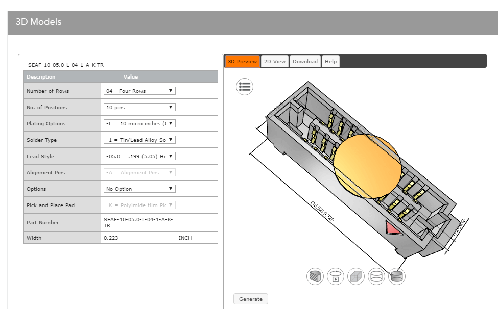
Using WebGL, a JavaScript API for rendering interactive 3D computer graphics, we even allow you to manipulate your model directly on the screen to get an idea of what you have just configured. This feature works across all major browsers and devices, including tablets, without the need for a plugin (this is not currently available on smartphone devices).
Note: You will need to download a plugin for IE10 since it does not support WebGL. We recommend upgrading to IE11 or newer, or using Chrome or Firefox for the best experience.
Once you have configured the product you want, you can get your instant 3D model by clicking the “Download” tab. Just select from a choice of nearly 100 different file types, and click “Generate File.”
In true Samtec Sudden Service fashion, these are all openly available to you without even entering an email address.
This powerful feature is currently available for about 80% of Samtec series. Our helpful 3D model group can help support you on the rest.
Fully Responsive to All Device Types
In the last 30 days as I write this post, there have been exactly 1,394 different screen resolutions used to access Samtec.com.
That number will be different tomorrow, the next day, and the day after that.
A good chunk of these are full HD 1920 x 1080 desktop machines, which has become ubiquitous with most widescreen desktop displays, but as you can imagine there is a wide level of variation across the remaining 1,393.
Here are just a few of the popular viewport sizes our design team had to consider:
- 2560 x 1440 (usually a higher end 27″ desktop display)
- 1366 x 768 (typically a more portable 15″ laptop)
- 1680 x 1050 (one step below full HD, typically used to increase on screen object size on smaller monitors)
- 1024 x 768 (older laptops with lower resolutions – plenty of these still around)
- 360 x 640 (either a smartphone, or someone with very strange desktop behavior)
And that just scratches the surface.
There is just too much variation to optimize for every single resolution. Because of this, and the fact these trends will change significantly over time, our web design team used a responsive design approach which adapts to all types of screen sizes on the fly.
To handle the nearly 1,400 variations with this approach, including vertical and horizontal orientations, we’ve built in logical breakpoints based on viewport size and orientation (how large your browser window is and how the screen is flipped).
Across most desktop devices, the screen will adapt to appear essentially the same, with spacial adjustments to accommodate variation. Once the user gets down to a typical tablet size, we begin to move and resize some objects to keep the experience consistent.
If the user gets to typical mobile size screen, again, we make an adjustment to keep the user experience intact. We also swap out some features on the mobile view to allow quick rendering of the page with the lower processing power of mobile devices.
This allows us to take nearly 1,400 variations down to just three in our code, drastically simplifying the front-end design process while delivering a consistent experience to you.
Mobile Product Research
It’s no secret the world of the web has gone mobile. Samtec.com users tends to be more tied to their desktops than most, but we still have a significant (and growing) user base that has been clamoring for mobile support.
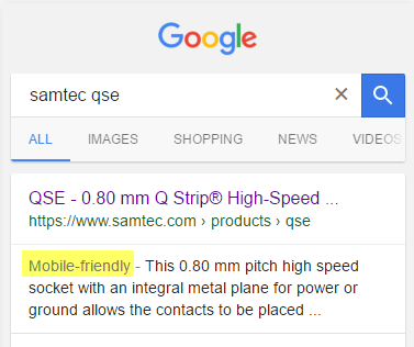
We’re happy to report that our mobile experience is developing nicely, even Google says so. 🙂
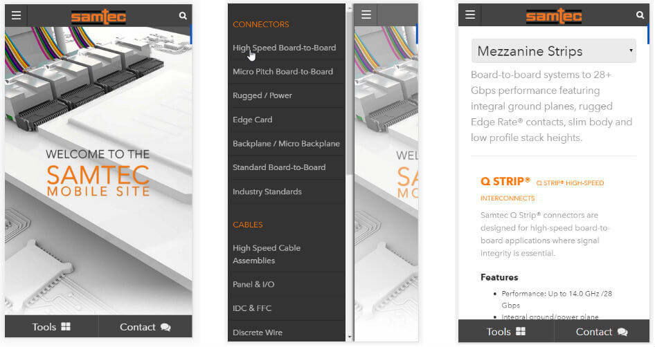
The ability to navigate Samtec.com on a smartphone has actually existed for several months, but until now we only had about half of the product research path covered.
With this release, we bring full functionality to your iOS and Android devices on Tech Specs pages, providing you with the ability to get basic product documentation right on your smartphone.
Just follow the menus from the homepage to the series page. There you can download Catalog Pages, Prints, Technical Documents, and see product mates.
You can even use our sharing widget to email yourself a link for later with just a couple of clicks.
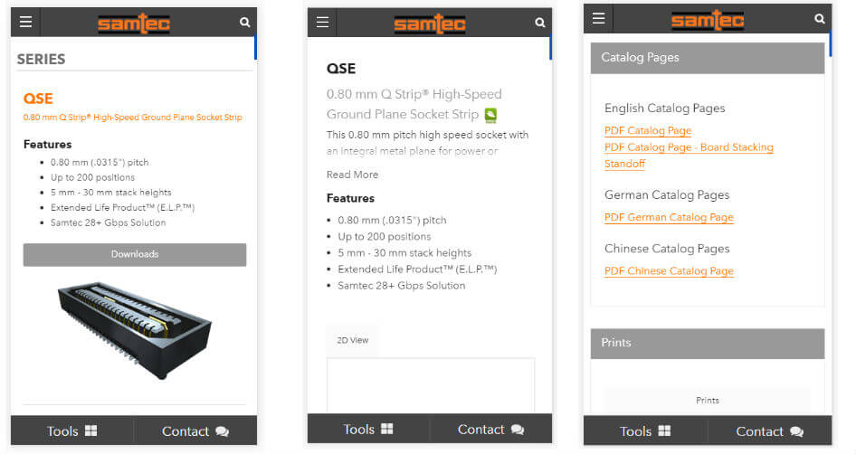
We’ve left the more complex documentation such as test reports and performance data on the tablet and desktop versions for now, but if you use the mobile version and miss those, we can certainly explore adding them.
Give it a shot!
Buy and Sample Online
The ability to buy and sample products online directly at Samtec.com has been available for over a decade, but this release puts more emphasis on making that process easier to get started. At the top of the page underneath the 3D models button, you’ll notice a couple of call-to-action buttons labeled Free Sample and Buy.

These will direct you to our Part Configurator, the same tool we use to bring you real-time 3D models.
Once you’ve configured your product, just use the Add to Cart and Free Sample buttons to the right of the configurator to proceed to the next step.
The next goal is to make this remaining part of the online research and ordering process “Amazon-easy” by improving areas of the site such as our Search, Solutionator, Cart, Checkout process, Order tracking, etc. as well as adding a variety of other experience-enhancing features and tools.
Keep an eye on the Samtec Blog to be notified when those are released.
Samtec Sudden Service Included
And of course, if you get stuck at any time, you can email any of our product groups, or even our helpful web support team by just using any of the email addresses listed throughout the page.
Samtec.com Is Built For You. Send Us Your Feedback!
These pages are now live on Samtec.com. We’re very excited to bring them to you. So now, it’s your turn. Here are a few of our more popular products if you’d like to play around with the new features.
- https://www.samtec.com/products/tsw
- https://www.samtec.com/products/qse
- https://www.samtec.com/products/seaf
- https://www.samtec.com/products/tfm
- https://www.samtec.com/products/erf8
We would love to hear your feedback so we can make these ever better for you in the coming months.
Just email [email protected] and we’ll be happy to talk with you!